Data Quality Dashboard
Monitor the health and timeliness of your tracking data, and drill into the containers behind each number. This section documents not just what each metric shows, but exactly how it is computed - which rows are counted, which are excluded, and why - so the figures can be used as evidence and reproduced independently.
Access: console.dockflow.com/data-quality
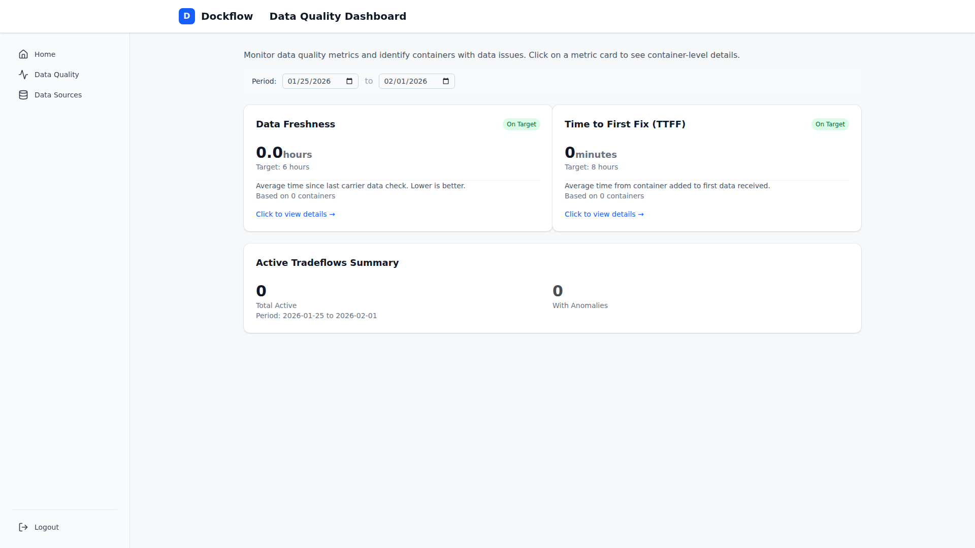 Data Quality Dashboard showing Freshness and TTFF metrics
Metrics overview
| Metric | What it measures | Target | Kind |
|---|---|---|---|
| Data Freshness | Time since the last carrier data update | 6 hours | Live snapshot (now) |
| Time to First Fix | Time from a container being added to its first data | 8 hours | Historical (by first_fix) |
| Confirmation Delay | Time from an event happening to its confirmation | 24 hours | Historical (by event_date) |
Each metric card displays:
- Current average value
- Target threshold
- Status indicator (On Target / Warning / Critical)
- Container or milestone count
- A separately-reported outlier count (values held out of the average - see below)
- Click-through to a container-level drill-down
How to read these numbers
A few principles apply across all three metrics. They matter most if you plan to reconcile a figure against your own export or use it as SLA evidence.
1. Every metric excludes an outlier tail. Each metric holds out values above 10 × target (Freshness > 60h, TTFF > 80h, CD > 240h) and reports them separately as an outlier count. A non-zero outlier count sitting next to a healthy average is the excluded set working as designed - not a fault in the average.
2. Averages exclude rows where the number would be misleading. Each metric drops specific rows - backfills, placeholder timestamps, events that predate tracking. The exclusions are listed on each metric's page. This is why a raw query over all rows returns a higher number than the console.
3. Two metrics are historical, one is live. TTFF and CD are computed over a chosen date range (by first_fix and event_date respectively). Freshness is always "right now" and has no historical view.
4. Historical figures are not frozen snapshots. The underlying milestones are recomputed whenever a tradeflow is re-evaluated, so a past month's TTFF or CD can shift slightly over time. If you hand a figure onward as SLA evidence, capture it as a snapshot at the moment you report it. See Metric history and baselines.
5. Confirmation Delay starts in March 2026. The field it is built on did not exist before then, so filtering to an earlier period returns nothing.
Active tradeflows summary
The dashboard shows a summary of your active tradeflows:
- Total Active: number of active tradeflows in the selected period
- With Anomalies: tradeflows flagged with a data anomaly (
anomaly > 0)
An anomaly is a binary flag - a tradeflow either has one or it does not. See Anomaly classification for what triggers one and what to do with it.
Date range filter
Use the date picker to filter metrics by period:
- TTFF filters on the
first_fixtimestamp. - Confirmation Delay filters on the
event_datetimestamp, inclusive of the whole final day. - Freshness shows the current live state and ignores the date range.
The selected range is interpreted in your local date, and the final day is included in full.
Container drill-down
Click any metric card to see the individual containers or milestones behind it:
- Sorted worst-first or best-first
- Paginated 20 per page
- Export to CSV, up to 1,000 rows
The drill-down applies the same scope and exclusions as the headline metric, so what you see is what the average is built from.